MOIRA'S
A Sustainable Identity for the Future of Circular Fashion
Moira's is a second-hand fashion brand built by a team of five, each bringing a different perspective, environmental awareness, sense of style, entrepreneurial drive, and background in graphic design and marketing, to shape something together. The brand was born from a clear intention: to change how people see second-hand clothing, breaking the stigma that has long linked it to scarcity or lack of style. Each garment is carefully selected, cleaned, and restored to shine again as if brand new, with the brand also accepting donations from those who share its vision of more conscious fashion.
Client
Moira's
Year
2025-2026
Industry
Sustainable Fashion
Turnaround time
6 Months

Challenge
The challenge was building an entire brand from zero. Moira's didn't exist yet, there was no name, no visual identity, no defined strategy. As part of the team, my role was to create the brand's image from the ground up: developing the visual identity that would carry everything the team was defining in parallel, its strategy, values, mission, and vision.
Strategy
We grounded the brand in its name and meaning. "Moira's" comes from the ancient Greek μοῖρα (moîra), meaning destiny or the part that corresponds to each person in life, referencing the Moirai, the goddesses who wove the thread of human existence. Adding the apostrophe gives it an immediate sense of ownership in English, ideal for global e-commerce expansion.
The brand was built around three core values:
Quality — garments chosen one by one, lasting materials, fashion reborn without losing its edge
Community — people, garments, stories, all speaking the same destiny, making fashion circular together
Care — every piece treated with attention, respect for the planet, detail as the brand's signature
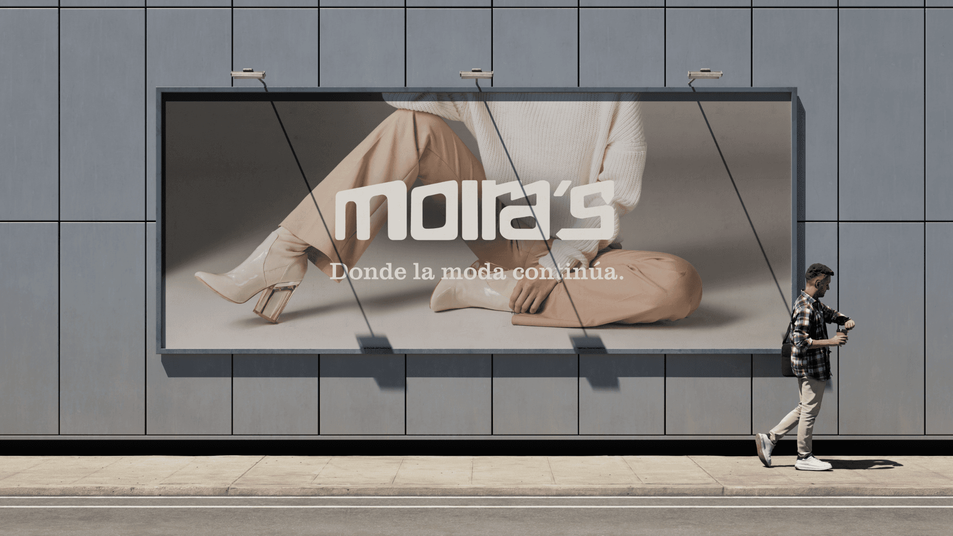
The logo combines modernity with symbolic depth. Its geometric, minimalist style targets an urban, design-conscious audience. The solid, structured "M" evokes a Greek column, referencing strength and classical heritage while subtly nodding to the myth of the Moirai. The "S," shaped like an arrow with circular movement, brings dynamism and represents the circular economy, renewal, and continuity, a cycle that repeats and regenerates.
We also designed an isologo: an "M" seal surrounded by the phrase "Higienizado y Revisión Manual," set in Super Clarendon, a typeface that brings a human, artisanal character to the geometric design. The black dot separating the phrases symbolizes the full cycle, the garment is reborn and begins a new story, together forming a seal of trust certifying that each piece has been carefully reviewed by expert hands.
The typography system reinforces this concept: Moiras (primary), adapted from Unispace Bold, shapes the "M" as a Greek column and the "S" as a circular arrow; Superclarendon (secondary), used in the isologo, adds warmth and craftsmanship against the geometric isotype.
Results
A brand built from zero, made real. In just one project cycle, the team defined Moira's from the ground up, name, meaning, mission, vision, and values, while I translated all of that thinking into a visual identity that could carry it. The result wasn't just a logo: it was a coherent brand system ready to face the real world.
An identity that did more than look good, it communicated. The geometric "M," the circular "S," the isologo seal, every element was built to reflect what Moira's actually stands for: care, community, and circularity. That coherence between concept and visual execution is what allowed the idea to read as a real, trustworthy brand from day one.
From concept to operating brand. Moira's didn't stay a class project or a moodboard. With the visual identity in place, the team was able to push the project forward and establish it as something functioning in the real world, with a defined presence across digital and physical touchpoints.
Proven in the field, at trade fairs. Moira's took its products and identity to multiple trade fairs, where the visual system, consistent branding, packaging cues, and booth presence, helped the stand stand out and actively pulled in visitors. This was the first real test of the brand outside a controlled environment, and the identity held up.
Broke through the second-hand stigma. By pairing a premium, design-forward visual identity with a sustainability-driven mission, Moira's positioned itself as a credible player in circular fashion, proving that second-hand doesn't have to mean lower standard, it can mean elevated, intentional, and desirable.
Delivered
Full brand identity system (logo, isologo, typography)
Brand manual (mission, vision, values, usage guidelines)
Logo versions and safety area/sizing guidelines
Application design: business cards, brochures, letterhead, mockups
Social media brand presence guidelines
Customer service protocol and brand voice/tone guide